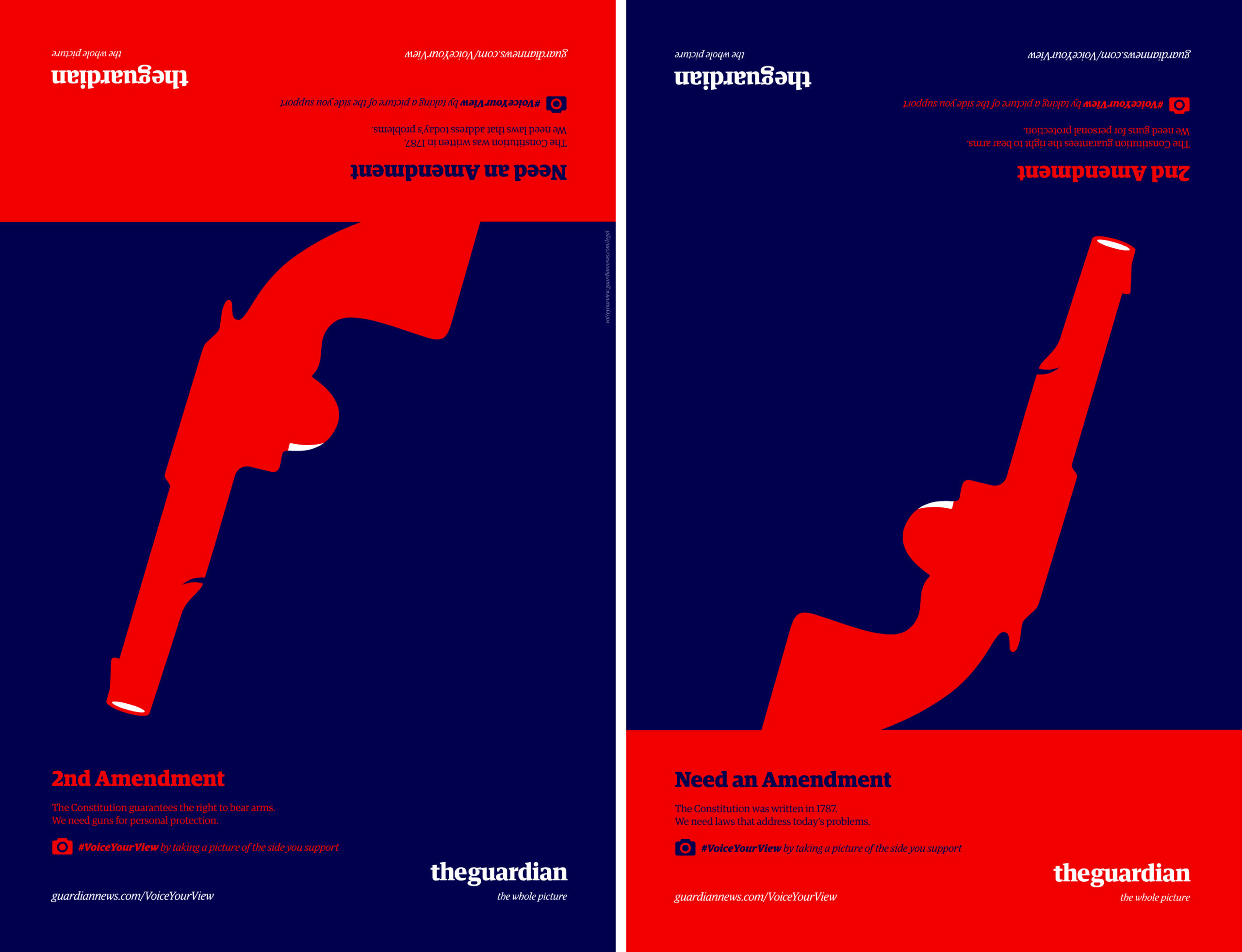
The aim of this article is to analyze the above advertisement for the visual elements that make up its rhetoric.
The Guardian has historically been a United Kingdom-based news outlet, but has slowly expanded to cover international and United States news, including United States-focused social and political commentary. As such, in 2013, the publication launched its first ever advertising campaign in the United States, aiming to tout their new focus on United States-based journalism and score a stable readership abroad. Presented here (see Appendix 1) is one such advertisement from that campaign. The campaign worked by cleverly presenting viewers with two sides of a contentious political issue – one side visible facing one direction, the other when the advertisement is flipped over. These ads were strung up in outdoor spaces, to be seen by commuters as they passed on by. Making smart use of cell phones and social media, the advertisements called on passersby to take a picture of the side they supported and post it to social media with the hashtag #VoiceYourView. A site was then created that captured and compiled these posts for others to view, weaving in relevant stories from The Guardian among the submissions, introducing readers to the publication and its work while educating readers as to the various sides of each political debate. Through the use of compelling color choice, interesting placement of elements, and a linguistic message relevant to the current political moment, this advertisement attempts to grip and engage viewers. The campaign aimed to position The Guardian to readers residing in the United States as a bastion of balanced, dependable news coverage of important and hotly contested issues.
Starting off, this advertisement leans heavily on a central iconic message to capture viewers’ attention. Occupying the vast majority of real estate on the page is the large, red silhouette of a handgun. Given the outdoor location of this advertisement, such a large, provocative image is highly likely to draw eyes. Examining the non-coded iconic message this gun conveys, a major part of its rhetoric and ability to attract is color. Bright red evokes excitement and energy, while also being demanding, provocative, and stimulating, as described by color theorist Leatrice Eisemann (Eisemann). Juxtaposed against a dark, purple background, the red stands out ever more. The effect of this is to arrest the viewer’s attention, and invite the viewer to engage with the rest of the image’s body. The positioning of the handgun is also of vital importance to invoking a sense of dynamism, and acting as a symbol for the linguistic messages. The gun is tilted, unstable. According to Molly Bang, “Diagonal shapes are dynamic because they imply motion or tension” (Bang 46). The symbolic, coded value of a slanted gun is to signify that the subject matter – that of the contentious discussion surrounding 2nd amendment gun rights – is an evolving conversation, one with much inherent tension and polarization. This gun, as much as the text, is a connotative call to arms to support whichever side of the debate the viewer falls upon.
In addition to its symbolic value, the position of the gun leads the viewer directly into the advertisement’s linguistic message. By following the implied line created by the gun barrel, the viewer arrives at a blurb in the bottom left of the image. At this point, the viewer has already gained an interest in the advertisement through the provocative gun imagery, and has slowed their pace to examine the accompanying text. The message here either mentions the need to protect the United States’ 2nd amendment right to bear arms, or mentions the need to create new legislation to curb the dissemination of guns. The denotative meaning of this text is a reference to the very prominent, current-day political discussion surrounding gun control, with either side of the advertisement standing in for the two primary, competing positions held by the public. Meanwhile, the connotative meaning of positioning these two arguments on opposite ends of the same advertisement space is to suggest and acknowledge the existence of opposing viewpoints. Next to these blurbs is The Guardian’s logo, followed by a subtitle that reads, “the whole picture [sic].” The two opposing arguments presented as the advertisement’s linguistic message, and the symbolic presentation of the two arguments as diametric opposites, come together to paint The Guardian as a publication that, as the tagline suggests, examines all relevant angles of an issue. Readers that wish to be well informed appreciate news outlets that engage in honest debate and fairly and equally portray all sides of a debate. By giving both sides of the gun debate an equal and dynamic position on the advertisement, The Guardian is able to effectively and immediately make the case that their journalism offers a diversity of opinions. The viewer is made to arrive at this conclusion his or herself, rather than be explicitly told, simply through connotation. This strengthens the viewer’s perception of The Guardian, as their trust in the publication now begins from a perceived personal conclusion, rather than an explicit proclamation by the outlet.
Additional color hints further connect the elements of this advertisement, while the layout of the text evokes stability and further solidifies audience trust in the publication. There exists only two very deliberate uses of the color white. While the rest of the composition is composed of bright red and deep purple hues, there are white highlights on the trigger and barrel of the gun, and both the logo for The Guardian and the publication’s website link are in white. This contrast enables The Guardian’s logo and website link to stand out and be easily digestible at a glance among the other linguistic messages present. The immediacy of this recognition serves to anchor the advertisement as a newspaper ad, as opposed to endorsement of a political party or a gun manufacturer. Political campaign ads have a tendency to appear disingenuous, especially to those that disagree with the politics on display. Anchoring the viewer’s perception of the advertisement early as belonging to something other than a political campaign is effective in dispelling the notion that the advertisement has an inherent slant, and invites readers of all political beliefs to engage with the advertisement’s contents. While the viewer is engaged and is visually exploring the advertisement, the horizontal alignment of the text lends the composition stability, despite the energetic red hue and dynamic position of the gun silhouette. The text frames the center, surrounding it on top and bottom with horizontal text. As Molly Bang asserts on the nature of horizontality, “Smooth, flat, horizontal shapes give us a sense of stability and clam” (Bang). Despite the contentious, polarizing debate around gun control, this advertisement tries to evoke calm, portraying The Guardian as a voice of reason in a turbulent political atmosphere.
“Turbulent” is an apt word. There are countless news publications in the market, but trust in mainstream news outlets has eroded in recent years as consumers have begun to distrust long-standing institutions. Entering this rocky media environment is a news publication from the United Kingdom attempting to resonate with readers in the United States. An ardent defender of the free press and its own high journalistic standards, The Guardian attempted to make a splash in the United States by offering up a series of advertisements that appealed to balance, stability, and fairness in covering contentious sociopolitical debates. Via the connotative meaning of equally presenting two sides of a debate, the advertisements intended to engender trust in The Guardian as a reliable outlet for news and commentary. The Guardian conveyed a promise to maintain perspective in turbulent times.

![Xenoblade Chronicles, Motivation, and Emotional Misattribution [WIP]](https://harshamohite.com/wp-content/uploads/2020/08/Xenoblade-Chronocles-3D-ds1-1340x1340-1-270x162.jpg)
